Content Area
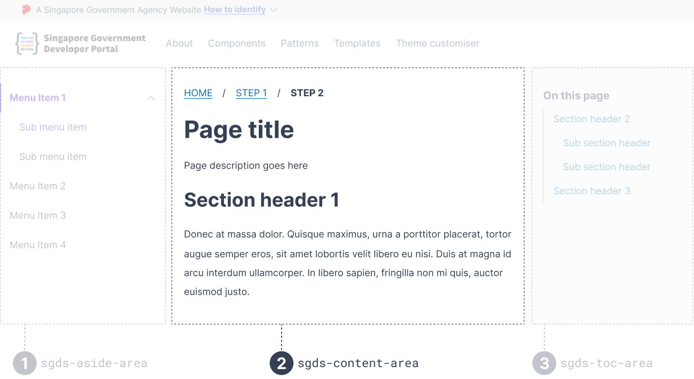
Content Area is the child of Template Grid and is positioned at the center of the page. It is a flexbox and accepts multiple children.

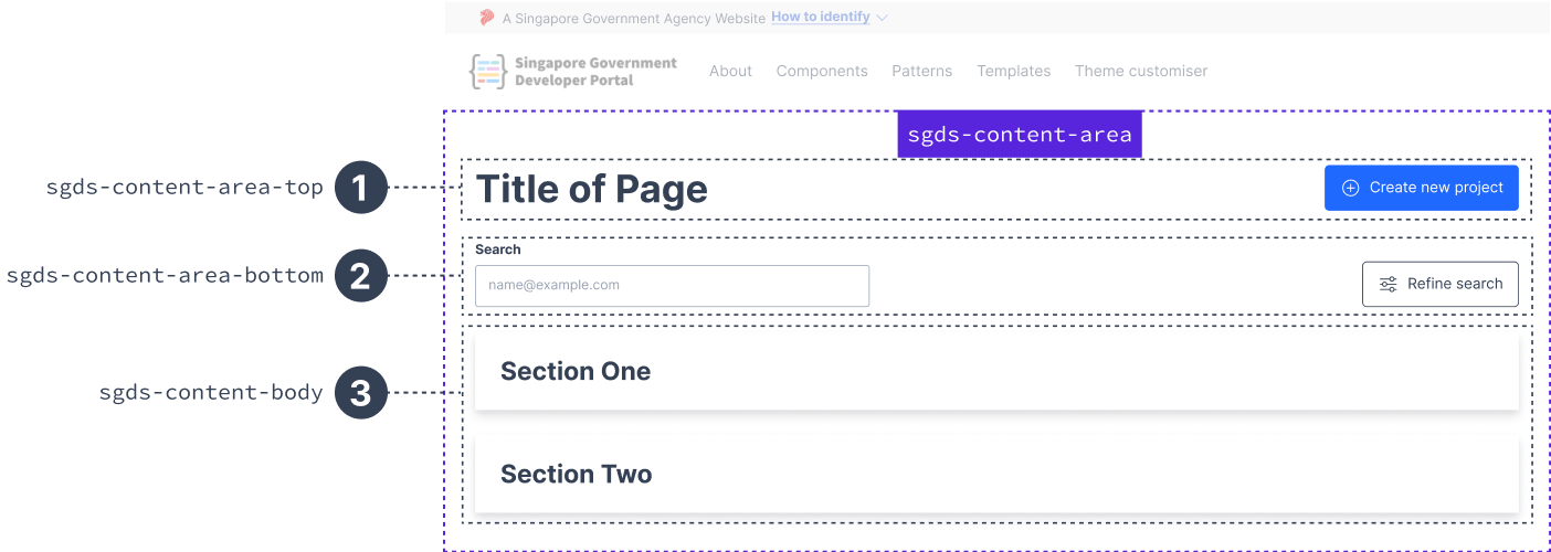
sgds-content-area is a flexbox of direction column and it's direct children will have a gap of 2rem apart from each other. We have designed 3 children containers for sgds-content-area based on our figma common layouts:
- sgds-content-area-top
- sgds-content-area-bottom
- sgds-content-body
Depending on your UI design, you can also include any components of choice.
Example
Usage with sgds-content-area-top, sgds-content-area-bottom & sgds-content-body

<sgds-template-grid>
    <sgds-content-area>
        <sgds-content-header-top>
            ...
        </sgds-content-header-top>
        <sgds-content-header-bottom>
               <div class="search-container">
                <-- input search -->
            </div>
            ...
        </sgds-content-header-bottom>
        <sgds-content-body>
            ...
        </sgds-content-body>
    </sgds-content-area>
<sgds-template-grid>
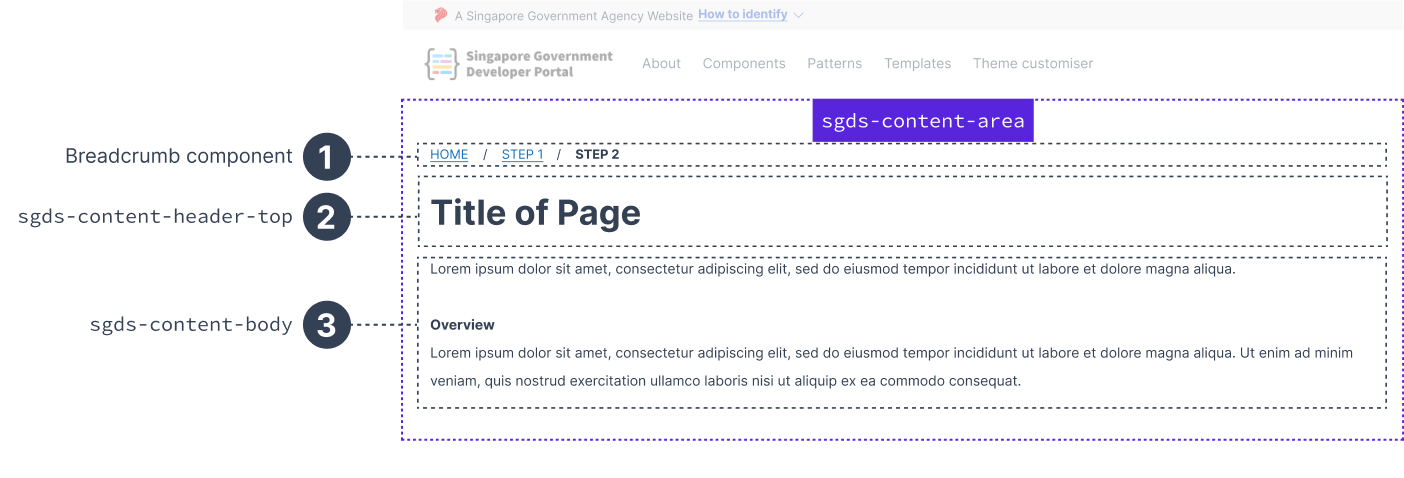
Using other components (breadcrumb component) with sgds-content-body

Content Header Top
sgds-content-header-top is a flexbox of direction row which should only accept up to 2 direct children.
Example

<sgds-template-grid>
    <sgds-content-area>
        <sgds-content-header-top>
            <h1>... </h1>
            <div>...</div>
        </sgds-content-header-top>
<sgds-template-grid>
Content Header Bottom
sgds-content-header-bottom is a grid divided into 12 equal parts.
- The first child with a class=”search-container” will be take up grid columns 1/5.
- The last child will take up the last grid column with whitespace: nowrap.
- Any other child of this grid, aside from those two describe above, will follow the default grid style of sgds-content-header-bottom.
The use case is rather specific to engineering services portal designs that have a search bar and button at the very end.
Depending on your design, decide if you need to use this container.
Example

<sgds-template-grid>
    <sgds-content-area>
        <sgds-content-header-top>
            ...
        </sgds-content-header-top>
        <sgds-content-header-bottom>
            <div class="search-container">...</div>
            <button>Refine Search</button>
        </sgds-content-header-bottom>
 <sgds-template-grid>
Content Body
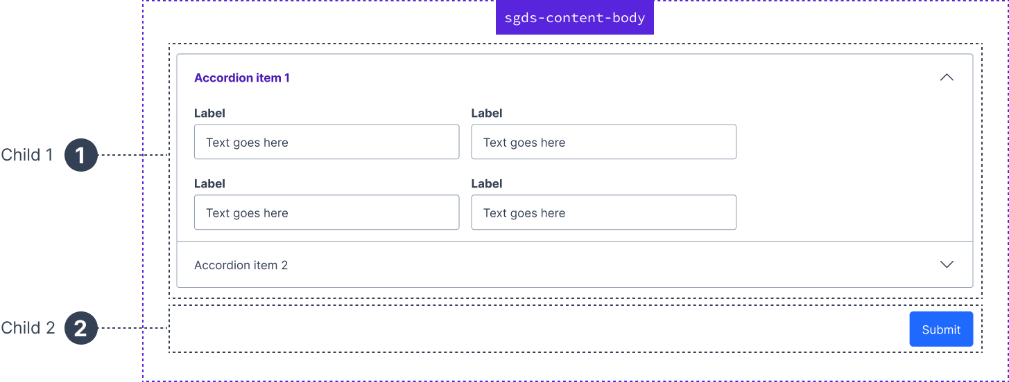
sgds-content-body is a flexbox of direction column. Its direct children have gap 2rem apart. Its styles are very similar to sgds-content-area. It helps to compartmentalise the html code in an organised manner. It can have n numbers of child(ren).
Example

<sgds-content-body>
    <sgds-accordion></sgds-accordion>
    <div> <button>...</button> </div>
</sgds-content-body>
Last updated 03 January 2024
